Showing posts with label Tessellations. Show all posts

Sunday, July 22, 2018

Walk Ancient Paths, Brainstorm Modern Quilts

Last week, my husband had a teaching gig in the French Alps, so of course I tagged along (devouring cheese). Afterward, we took a train to nearby Lausanne, Switzerland, where we had about a day to see the sights, before flying home. 

I was never someone who constantly takes pictures - not until this vacation. But now I have a new cell phone that hold its charge well. So I took many more photos than usual, and back home, I picked some favorites, to trace and mine for piecing and quilting ideas. 

The first sight we explored was the 13th century San Francois church. It has many doors, and took us a while to find one that opened - one that didn't open had this: 
 That's a quilt, for sure! 
A little color to prove my point:  
I can rest my case! But no, I'll keep going. Inside, the church is mostly grey stone, so the warm brown wooden furnishings glowed. I loved this:  
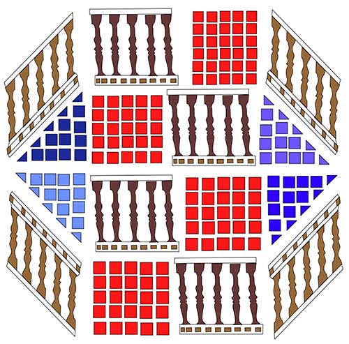
Tracing it helped me understand why it caught my eye...
...The contrast between curvy and straight, long and compact shapes. I rearranged the elements into an architectural octagon. 
The church's organ is heavenly, but far above my pay grade to replicate in fabric. 
It's held up by these two: 
 I traced and simplified them, painted their violin turquoise, et voila!
They'd make a nice quilting design for corners and other triangles on quilts: 
 
The design painted on the ceiling has proven its triangle-filling potential.
From overhead to underfoot, the streets are paved with more quilt brainstorming gold. Like this...
Traced: 
Another one: 
Made up of tiny octagons, with squares in their centers. 
There are wave after wave of squarish paving stones, set in scallops: 
...with the occasional drain for counterpoint:  
Below, a radiating circle with surrounding arcs: 
The next design is a tessellation. I think it looks like vertebrae. I bet it could be English Paper Pieced. It could also serve as a filler quilting design, though I'd have to mark it first - no way I could stitch this accurately freehand. 
Another stop on our walking tour was the Palais de Rumine, an Italianate building from the late 1800's. It houses five different museums - none of which was open on the day we were there! Dang! We were, however, allowed to run up and down the stairs and take pictures of the floor. The tile motifs were awesome:
Simplified: 
The next one would make an excellent quilt border: 
And here's an all purpose design:
 Traced, with a little simplification....
Looking closely, I discovered that the artisans did the tile equivalent of "echo quilting" - a couple rounds of tiles surrounding and echoing the shape of the motif, then straight rows. In the next photo, for example, look above the head of the lion on the left - there are 4 or 5 rounds of echo tiling between the lion and the (sword? stick?). But over the the head of the lion on the right, it's just one row of echo tiling.
The Lausanne Cathedral was built around the same time as the Francois Church, but it's much more elaborate. The pillars are adorned with intricate, judgmental folk:

(The guy on the left looks familiar. Moses? Is that you?) Here's the church's famed Rose Window. Most of the glass dates to 1230. 

Tracing it in my computer program, I discovered that the artist had welded and broken apart a great many circles:  
The formations made me think of fluffy clouds....
...which isn't far from its original intent. "In medieval times, large rose windows were often a representation of the universe," this informative website explains. "Thus Lausanne's large rose contains images representing the four seasons, four elements, four winds, four rivers of paradise, as well as the twelve labours of the month and the signs of the zodiac." (An even more detailed study of the window is here.)

And speaking of circles...We strolled along Lake Geneva, and popped our heads into what must be the fanciest hotel in town. if not the country, the Palais Beau-Rivage. Through glass doors, I photographed some of the chandeliers, or rather, the circular formations from whence the chandeliers dangled....
When I simplified this one, I wound up with something that looks very much like an African fabric motif! 
The next one...
I like the almost-haphazard "slats" with angled tops that emerge from the center. 
Another useful idea on top of a ballroom door....
...It would also make a nice filler for an arc-shaped quilt expanse
Some of my favorite designs were found in the Hotel Victoria, the  elegant little inn where we stayed, around the corner from the train station. Their decor combined 17th and 18th century European art with modern abstract art, plus sculptures from Africa and Asia.  Below is the huge woven tapestry that hangs in the entrance - it  knocked me out. I'm pretty sure this is contemporary (but the clerk couldn't tell me anything about it, and there was no label)...

Closer: 
Another wallhanging the same size, about ten feet wide, and I'm guessing done by the same artist/workshop:
...and a third (and check out the whimsical wrought-iron rail in front of it)...
...The fourth one is so minimalist that you might expect to see it at Quiltcon (if it were a quilt and not a weaving).
The white parts are woven in, not gaps. I was also entranced by the hotels' tile floors, which peeped out between rugs.
Figuring out the arrangements in different areas was a lot of fun....

We did a LOT of walking. So we granted ourselves other sensory rewards. Like this afternoon cappucino....
...and the following dinner salad adorned with puffs of chevre, goat cheese, on toast. 
The chevre was the exact consistency of a perfectly roasted marshmallow, with a slight skin and warm melty center - divine. DH ordered that dish in the distance, a chanterelle tagliatelle. OMG! (acronym for "Oh My, Gluten!")

More quilting inspiration from ancient streets to come....

Sunday, June 3, 2018

Mini-Quilt Challenge: Connecting With Hard-to-Love Colors

A personal question: How do you feel about this color scheme?
It was the palette for Curated Quilts magazine's recent "Connections"  mini-quilt challenge.  My first reaction was "ugh!"  They're calling that color in the upper right, in the picture above, "mustard." And the middle bottom is named "moss green." But it struck me how similar they are to the colors of my late unlamented 1960s childhood kitchen, avocado green and harvest gold, which themselves are euphemisms for "overripe avocados" and, I am sorry to say, "upchuck tan."

Still, I liked the "connections" theme. Plus, the whole point of challenges is to force you to do something new, and often, uncomfortable. So I made this 10" square piece:
Everything that isn't white is an applique. The star on the upper left hangs out beyond the edge (thanks to a yellow felt backing):
How did I get to stars? The first things "connections" suggested to me was people holding hands. That made me think of linked paper dolls. Then I thought about linked 5-pointed stars, with touching points. So I grabbed some scrap paper (the informational paper that comes with batting), and did a back-and-forth fold,
 ...and folded that strip back-and-forth into squares...
 Drew a rough star....
 Cut it out, leaving tips intact...
 Unfolded it and out came this....
I was intrigued by the shapes between the stars, so I repeated the exercise, but this time in my graphics program - drawing a star, and flipping it to make rows, then flipping the rows to make columns,  just as I'd done by folding paper, but more accurate. It printed out like this:
There were four distinct shapes: the stars (in yellow, below); the "lozenges" in brown; the teal diamonds; and then, what I thought of as "joined pentagons" - the shapes in light lavender, which look like two pentagons joined at their bases.
This struck me as interesting! Plus I could fancy it up a bit more if I fit smaller 5-sided stars into the pentagons (in pink), and four-sided stars (in turquoise) to break up the big lozenges!
I assigned every element a color from the challenge's official choices. Then I printed out the pattern page, which without color looked like this:
I traced the shapes onto paper-backed fusible web, then pressed the pieces to the backs of solid-color fabrics. Cut out the shapes, and fused them, at an angle, on a 10" x 10" white background square.  I appliqued each shape with the neatest zig-zag I could muster (as opposed to mustard.) All the white areas are background fabric, except inside the mustard lozenge below. (Just thinking about mustard lozenges makes my throat hurt.)
I added a single lighter green star as an afterthought - 
It represents the birth of fresh, new baby avocados to take the place of aging avocados elsewhere on the quilt, and in the unrenovated mid-century kitchens of America.

Check out how a lot of talented quilters turned this color scheme from somber to fascinating, at the bottom of this page. There are some really great quilts! And I'm growing fonder of the palette! (Except mustard.)